I hate Windows 8
Wow. No Start Button.
OMG I had the displeasure of using a brand new laptop with Windows 8 recently. It was not too pleasant to discover the Start menu was missing, and pressing the Windows key brings up a crazy fullscreen menu with a horizontal scrollbar. It actually reminded me of Windows 3.1 and File Manager - because you would get this really plain empty screen every now and then. It seems that The Ribbon is also making more of an appearance, which makes me want to puke.
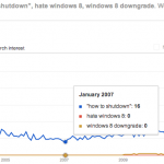
An Analysis of Google Search Volume
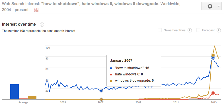
In the graph above you can see correlated rises in user search volume in January 2013 for "how to shutdown", "hate windows 8" and "windows 8 downgrade". I think I can also see a little bump back in 2012 someplace. This shows users around the world are finding it hard to figure out how to shut their machines down and getting on Google. I actually did this myself the very first time I used the machine. Let's say it again - I myself went on Google to search on how to do a restart. Turns out you hover bottom right corner, choose Settings... and then Shutdown. Why shutting a computer down could be a setting is anybodies guess.
Number of pages with "i hate windows 8" somewhere in them...
23 July 2013 -Â 410,000 pages!
25 March 2013 - I can see 313,000 webpages with the exact phrase "i hate windows 8". Lets see how this number increased over time.
1 May 2013 -Â 342,000 pages an increase of 29,000 pages in about a month.
Number of pages with "i hate windows 8" in the title...
23 July 2013 -Â 9,160 pages!
26 March 2013 - 7,080 pages with this exact phrase in the title.
1 May 2013 -Â 8,140 an increase of 1,060 and with the publication of this very blog post - yet another page on the web about this.
So my question to Microsoft is this: please put the Start Button back! You can do this with a service pack and give people the choice to use the whacky new aero thing.
The Ribbon - Yuck to the max
This has got to be one of the worst UI designs ever. Surely this has been scientifically proven now? It takes up too much space.

I really prefer pull-down menus to the ribbon. Saves screen space. I'm sure people love clicking on it with the mouse - but to be a fast computer user you need to try as much as possible not to use the mouse for repeated things like copy paste. Look at how big those copy paste buttons are! So with the removal of those little underlines that you used to see that would help you figure out the keyboard shortcut are gone. You have to press and release the alt key to bring up the hints and read from those - arguably not that much different from the old way of pressing Alt-F to see the File menu, but still a wee but slower, and I'm not sure if the cursor keys work.
Aparently they also removed suport for playing DVD movies in MediaPlayer! Couldn't afford the license fees. You can install other software apparently but man that is odd.
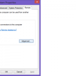
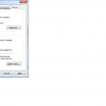
Did they remove Remote Desktop server?
It seems like MS removed the RDP server. Compare the two windows one from 7 the other from 8:
- How to shutdown windows 8
Further Reading
http://www.theregister.co.uk/2013/04/10/pc_market_win8_bloodbath/
Make Your Own Shutdown / Restart buttons:
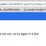
...meanwhile everytime I try to login to my live account I see this for many days perhaps weeks now:

